
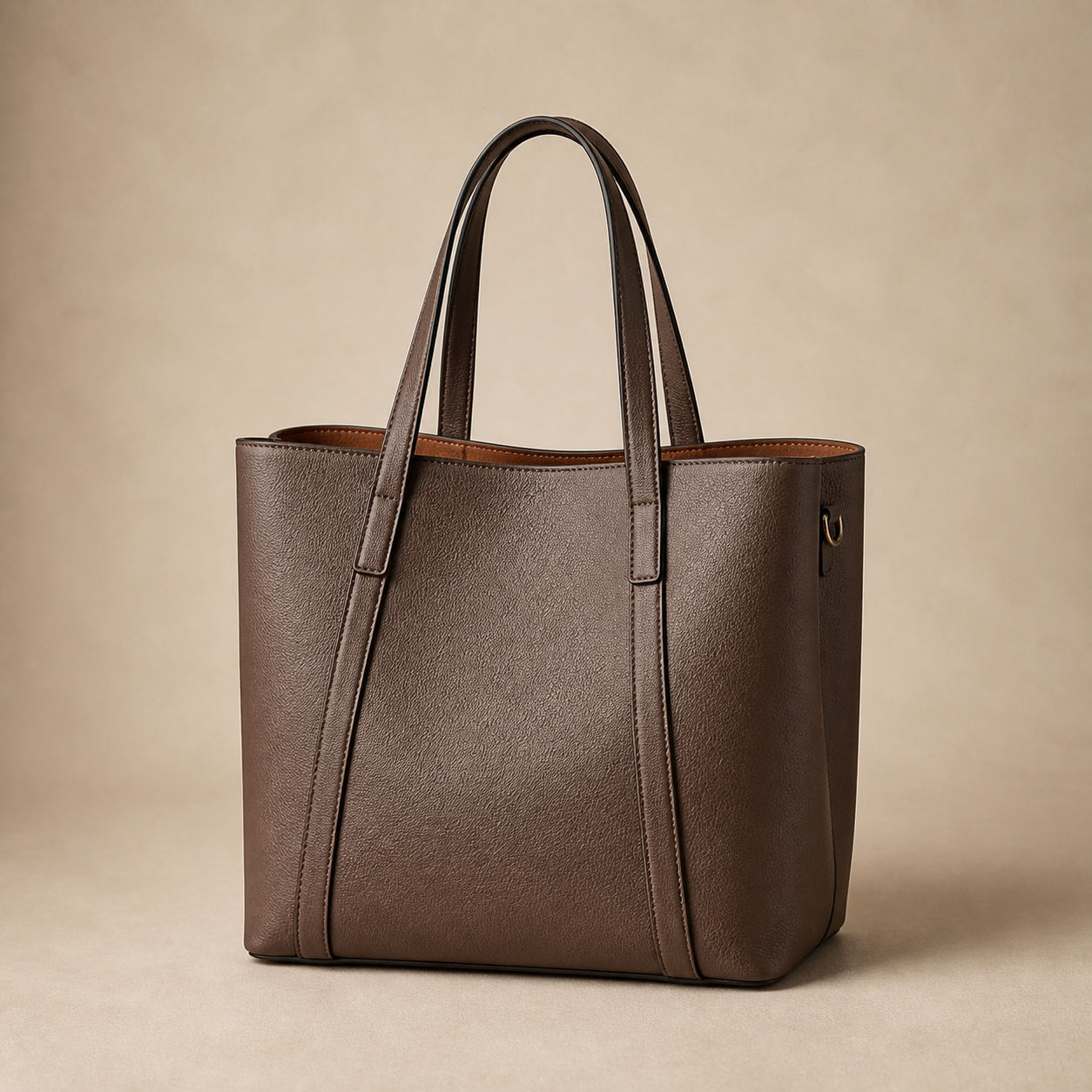
Every season, brand teams send factories a Pantone reference and expect the bags to come back in exactly that colour. Sometimes they do. Often the outer material is close, the lining is off, the thread is a guess and the hardware plating reads warmer than the leather. None of these suppliers made a mistake—they each matched the code on their own material, under their own light. Colour management is the discipline of turning one code into a controlled result across every component.
Setting a colour standard that survives production
A reliable colour standard has four elements, and a screen is not one of them:
A recognised colour code
Pantone (TCX for textiles, or the closest coated reference) gives everyone a common language. It defines the target—but not the result on any specific material.
A physical swatch
A signed piece of the actual material—PU, leather, lining fabric—dyed to the target colour. This becomes the master standard that both sides keep. Codes describe colour; swatches prove it.
Lab dips and strike-offs
For custom-dyed materials, the supplier produces small trial batches for approval before bulk dyeing. Approve the lab dip on the production material, not on a substitute—paper and fabric read differently from coated PU.
Agreed viewing conditions
Colour judgement depends on light. D65 daylight simulation is the common standard for textile and leather goods. A swatch approved under warm showroom light and judged under cool warehouse light will produce an argument, not a decision.
Watch for metamerism: two materials can match perfectly under one light source and visibly separate under another. It is why "it matched in the office" and "it looks different in the store" can both be true—and why the viewing condition belongs in the written specification.
Matching colour across different materials
A single handbag colourway typically touches five or six colour-bearing components. Each one takes dye or finish differently:
Outer material
PU and vegan leather are coated, so colour sits in the finish layer and can be controlled tightly; genuine leather is dyed through and varies more by hide and batch. The same Pantone target produces visibly different depths on the two.
Lining fabric
Textile dyeing follows different chemistry and a different colour system. Match lining to the outer material by physical swatch, and accept that an exact numerical match across material families is not achievable—the goal is a harmonious read, not identical values.
Thread and edge paint
Small but conspicuous. Thread that is two shades off reads as a quality defect on contrast stitching, and edge paint frames every panel. Both should be matched to a swatch, not described by name.
Hardware plating
Metal finishes sit on a warm-to-cool spectrum of their own—light gold, champagne, gunmetal. Plating is matched to a metal swatch under agreed lighting, as covered in our hardware specification guide, not to a Pantone code.
The practical rule: approve colour per material, on that material, and define which pairs must match each other. On most bags the critical pairs are outer material to edge paint, and lining to zip tape.
A note on timing: custom-dyed materials add supplier lead time to every colourway, which is why colour count and delivery schedule are linked decisions. Brands planning tight calendars often launch in two or three well-controlled colourways and add more on the repeat order, once the standards and dye lots are proven. Fewer colourways matched properly beat more colourways matched loosely—both on quality perception and on the calendar.
Running colour approvals without losing weeks
Colour approval is a logistics problem as much as an aesthetic one. Physical standards must travel, and every courier round costs days. A few working habits keep the calendar intact:
Send physical references early
Courier the master swatch set at sampling stage, not after sampling. The factory cannot match what it has not held, and photographs do not carry colour reliably between screens.
Use photos for process, not approval
Photos and video calls are useful for reviewing progress and catching obvious misses. Final approval belongs to the physical lab dip or swatch—photographing colour for sign-off imports every camera and screen difference into the decision.
Keep duplicate signed standards
Both sides retain a signed swatch of every approved colourway, labelled with style, season and material. This pair of standards is what makes repeat orders and dispute resolution fast.
Write the tolerance before production
Define which panels must match exactly, what variation within a lot is acceptable, and what counts as a reject. Bulk production always contains some variation; a written tolerance turns it from a dispute into an inspection check.
Plan reorders against the retained standard
On repeat orders, confirm the material supplier and dye-lot plan before production. Supplier changes are the most common cause of colour drift between seasons—and the easiest to catch early.
The colour specification to send
- Pantone or recognised colour code per colourway
- Physical master swatch per material, signed and dated
- Lab dip or strike-off approval on each production material
- Agreed viewing condition (for example D65) for approval and inspection
- Critical colour pairs that must match (outer/edge paint, lining/zip tape)
- Written tolerance: exact-match panels, acceptable variation, reject limits
Questions brands often ask
Is a Pantone code enough to produce a handbag colour?
A Pantone code is a starting point, not a finished standard. The same code reads differently on PU, genuine leather, fabric lining and metal plating because each material takes colour differently. Brands get reliable results by pairing the code with a physical swatch and approving a lab dip or strike-off on the actual production material.
How much colour variation is normal in bulk handbag production?
Some variation is unavoidable between material lots, dye baths and production batches. What matters is agreeing the tolerance before production: which panels must match exactly, which variation is acceptable within a lot, and which is a reject. Without written tolerances, every difference becomes a negotiation after the goods are made.
How do brands keep colour consistent on repeat orders?
Keep a signed physical standard for every colourway—material swatch, thread, lining and hardware plating—and have the factory hold a matching set. Each repeat order is then matched to the retained standard rather than to memory or a new screen image. Confirm the material supplier and dye lot plan at reorder stage, since supplier changes are the most common cause of drift.